


About
DAKSHIN
Dakshin is a wellness and lifestyle brand offering a curated range of Ayurvedic and herbal teas, body care items, and essential oils designed to support daily wellbeing and ritual moments. Its products focus on natural, organic ingredients and mindful self‑care, aiming to bring simple, nurturing experiences into people’s lives.
-
ClientVijay and Vasudha
-
Year2024-25
-
RoleBrand and Packaging Designer
-
Website
The
Problem
Health and wellness packaging often lacks clarity, cohesion, and a distinct identity in a crowded market of natural products. Dakshin needed a unified visual system that could clearly differentiate its tea, body care, and aromatherapy lines while emphasizing its organic, uplifting, and ritualistic spirit.
Solution &
Result
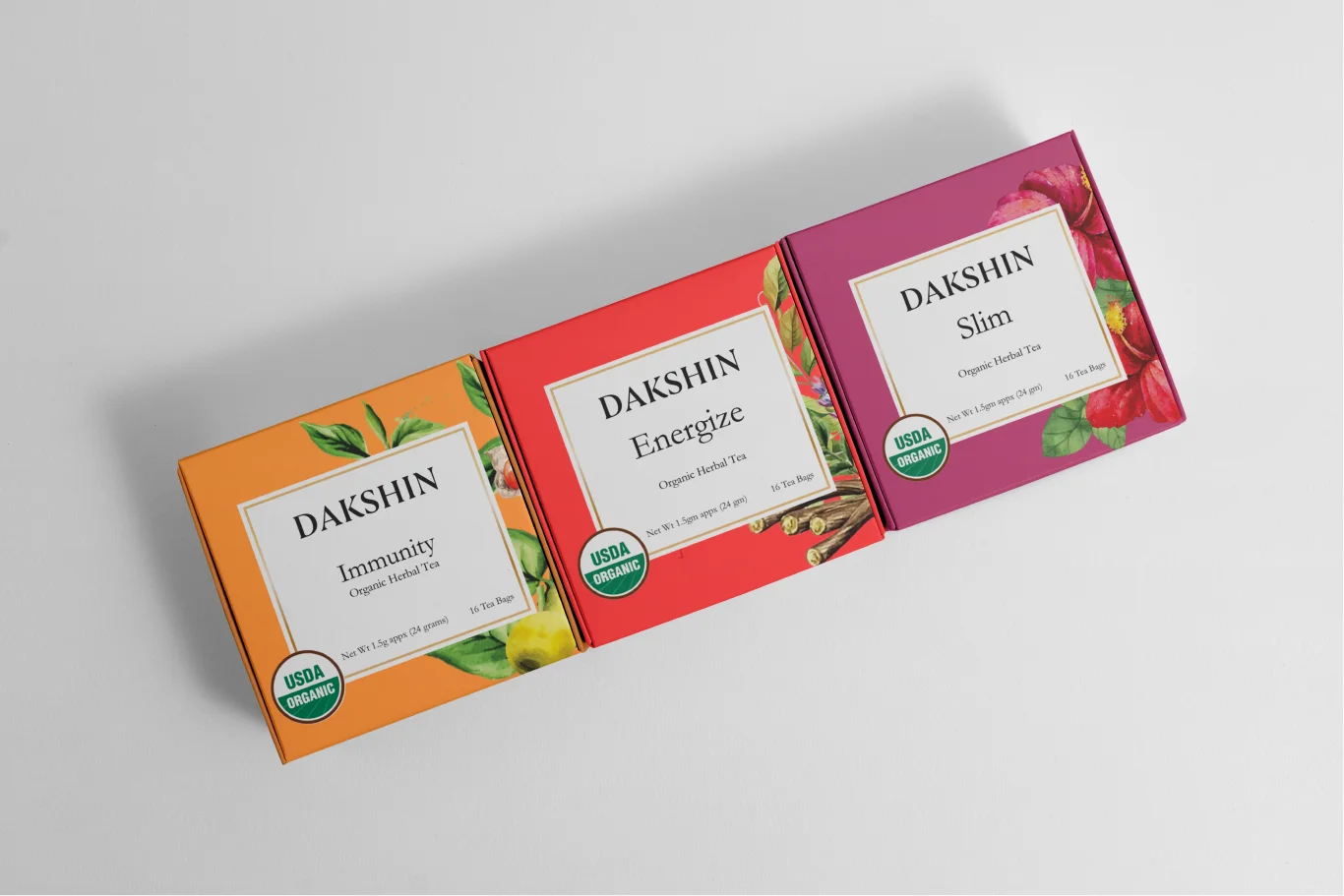
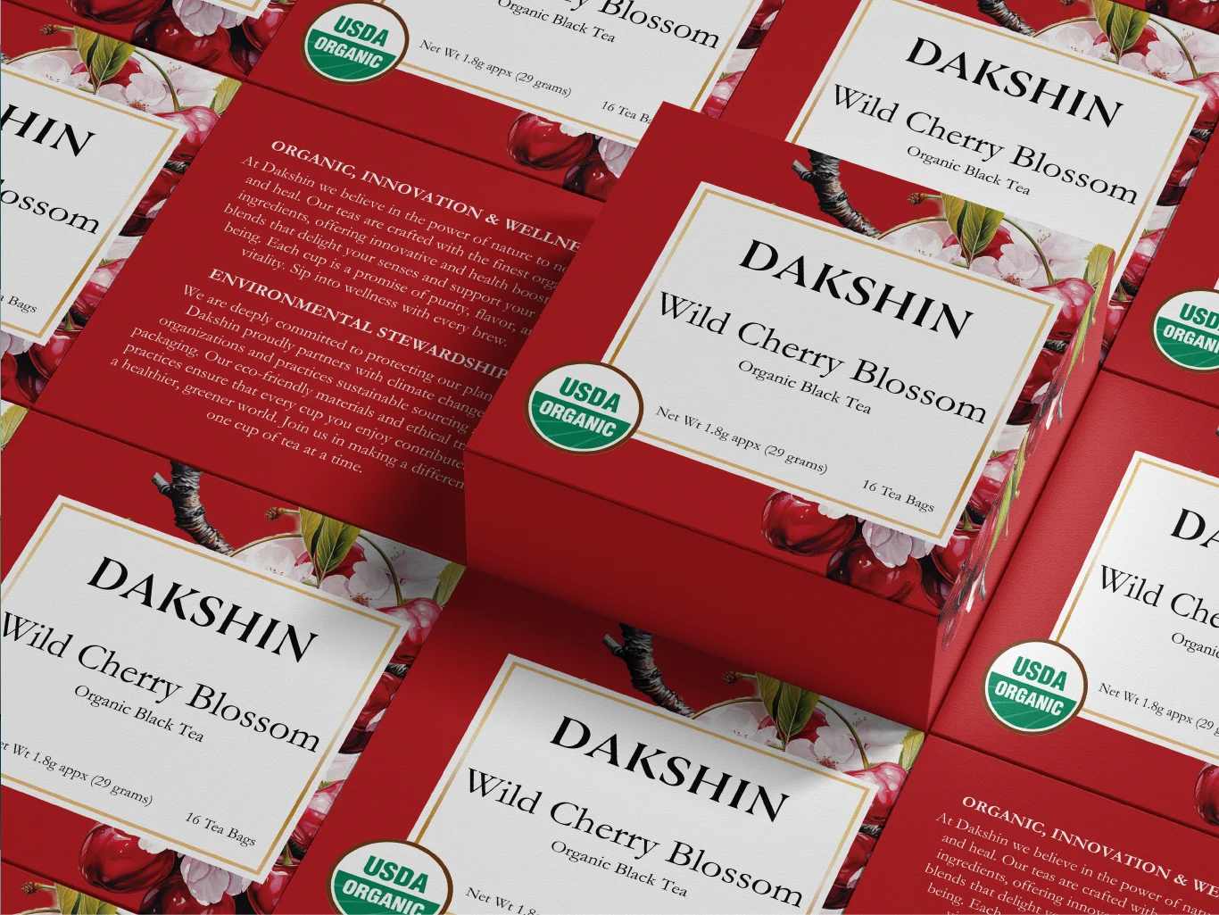
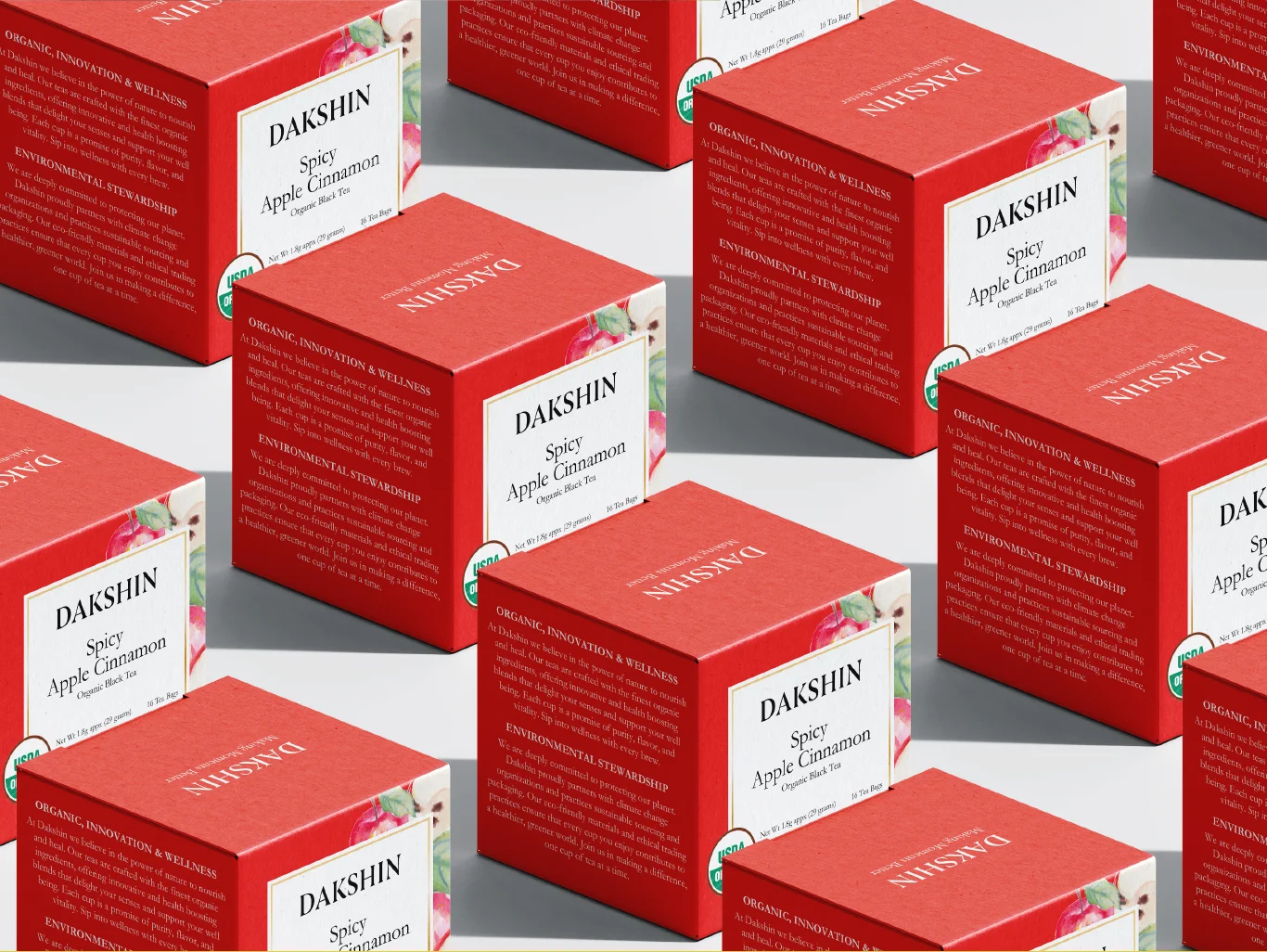
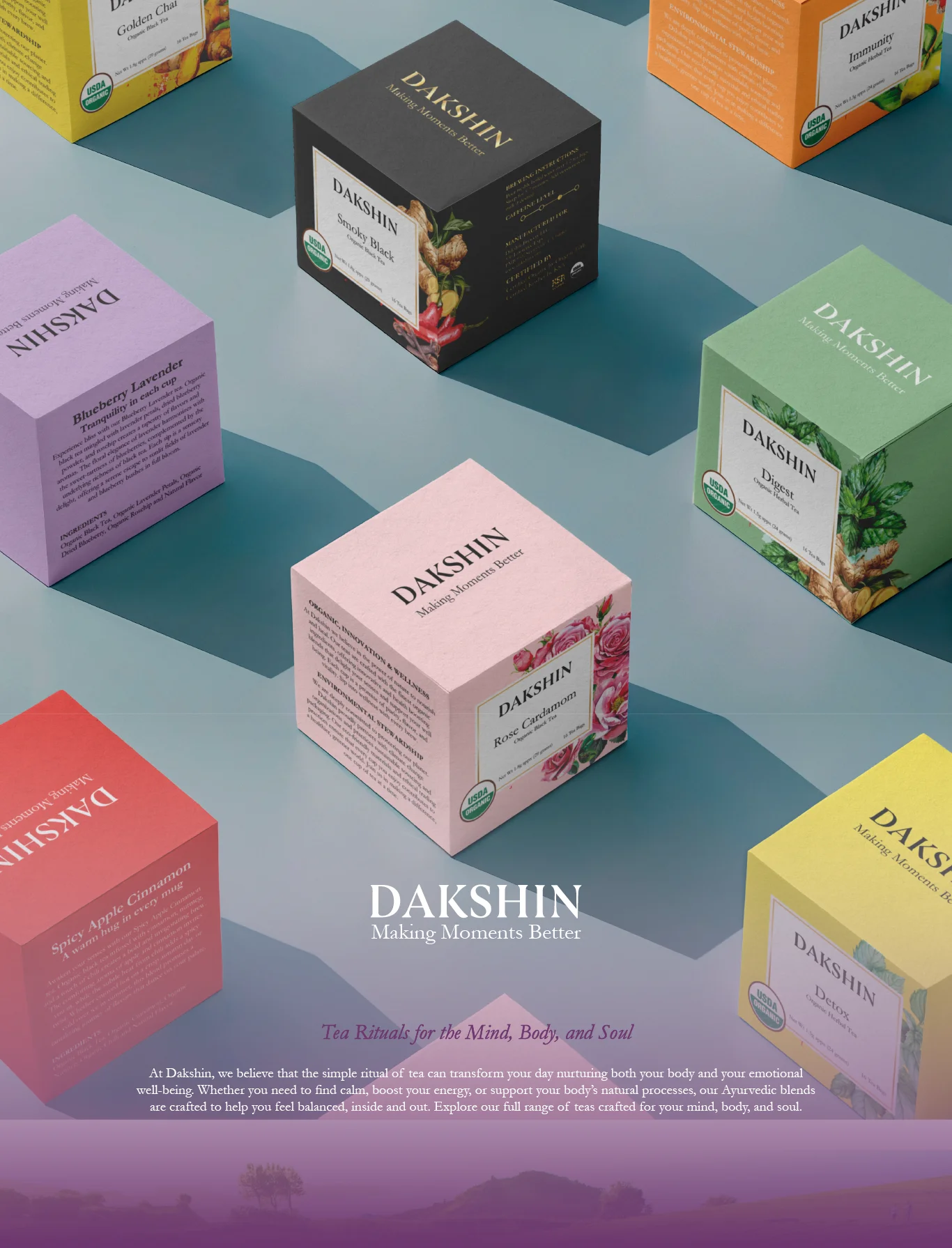
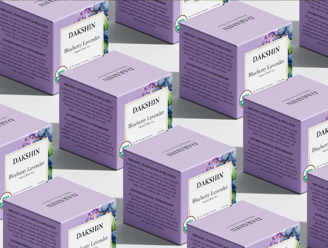
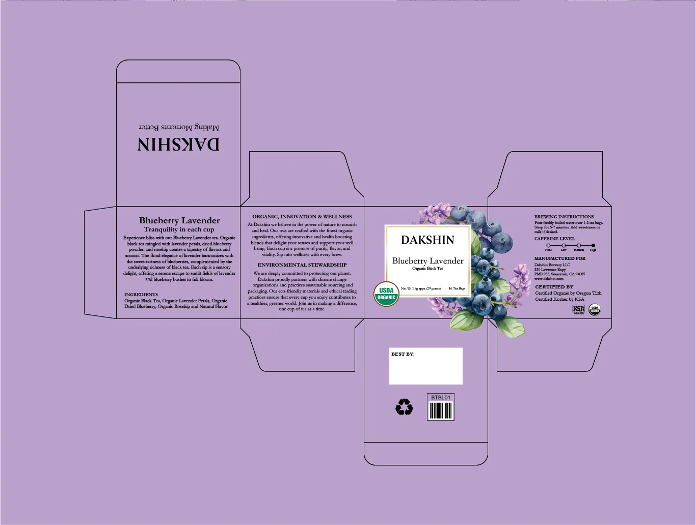
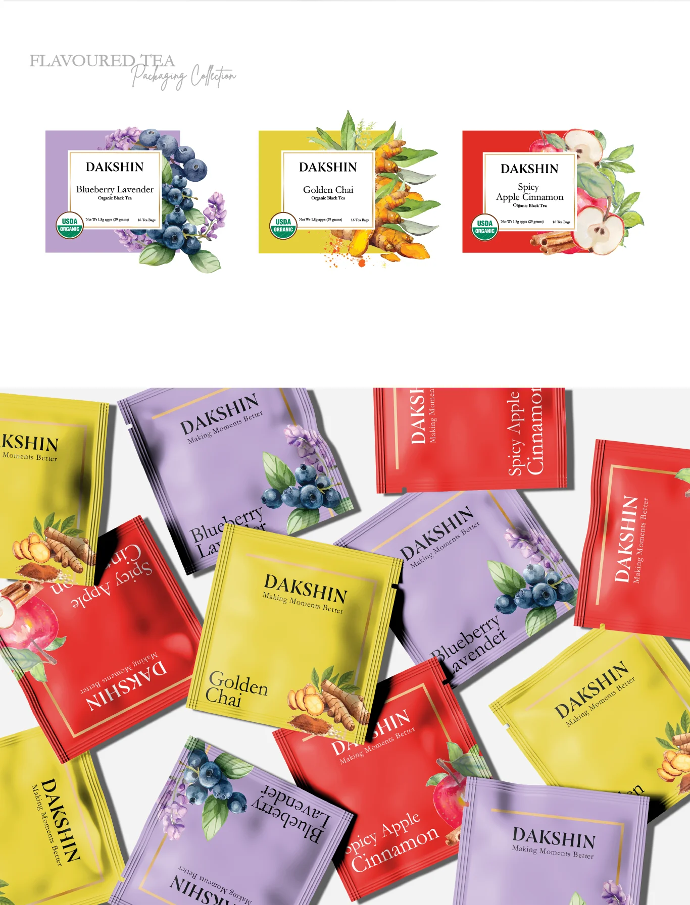
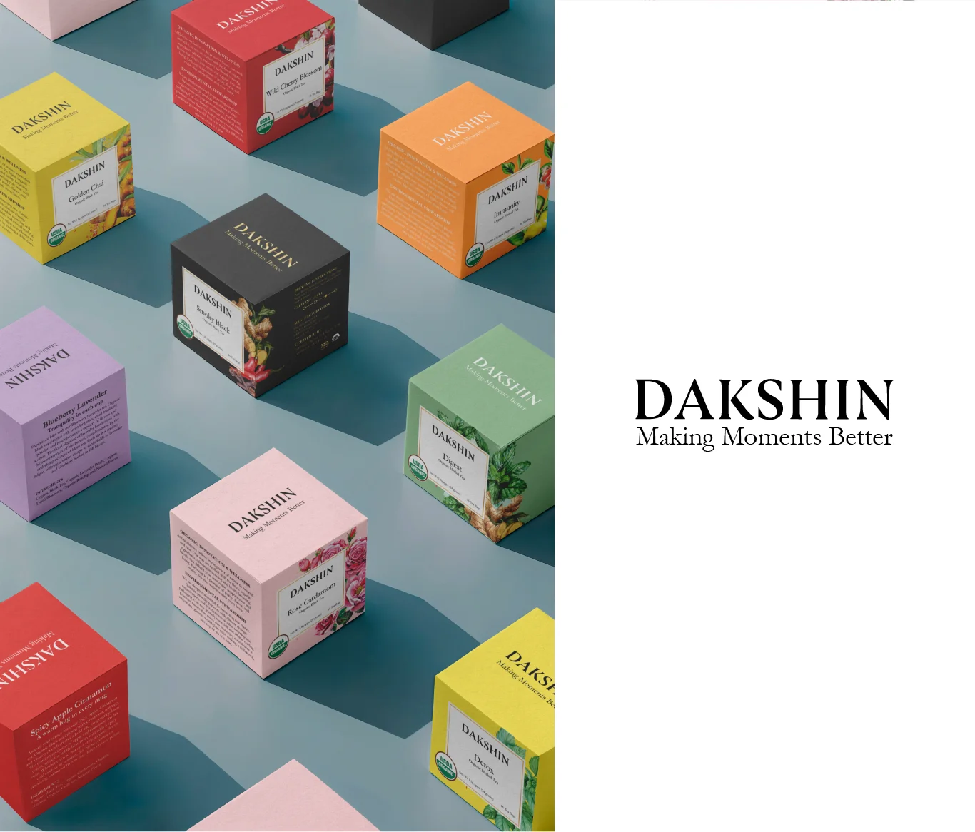
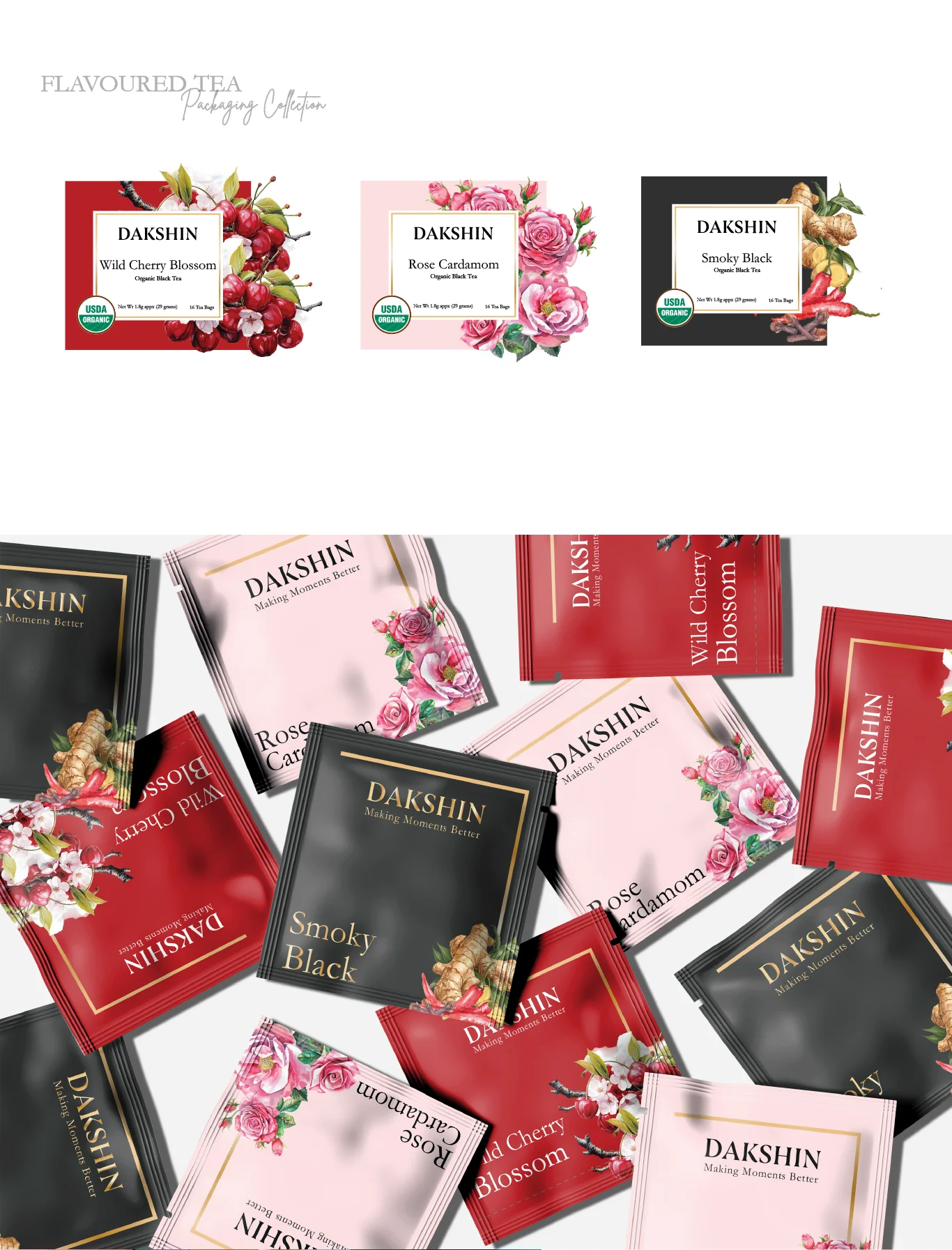
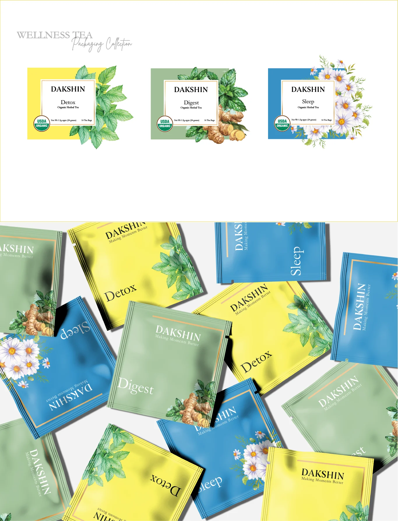
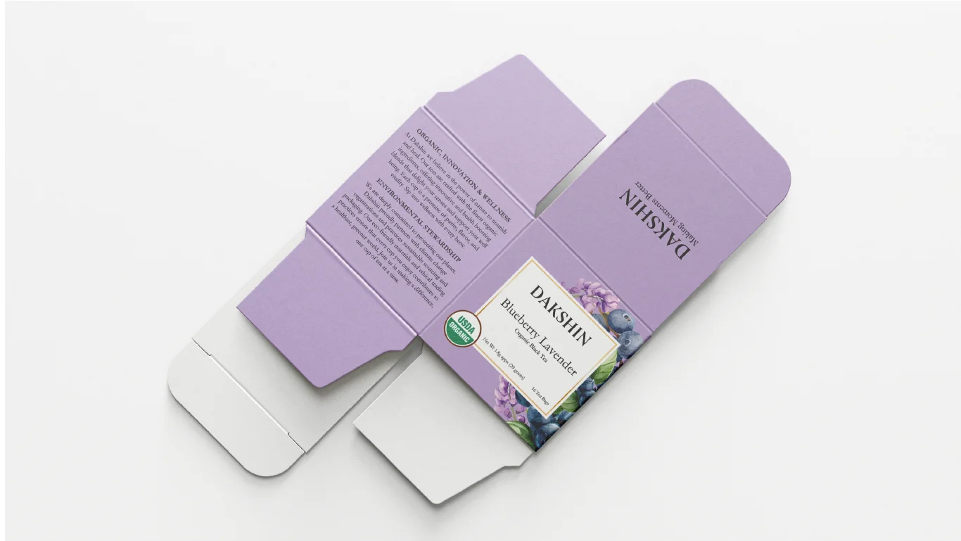
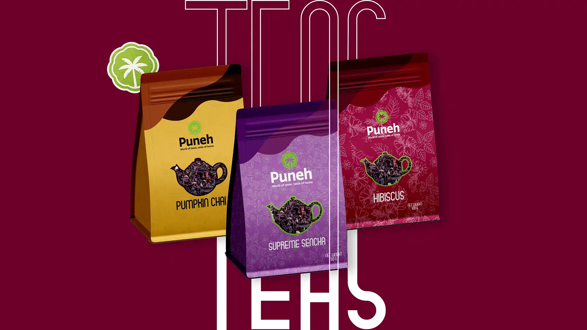
We developed a cohesive packaging system built on warm, soothing tones and organic visual cues that reflect Dakshin’s wellness focus. Tea blends use calming colors and clear labeling to communicate benefits like immunity, digestion, and relaxation. Body care products are presented with gentle, nurturing layouts that evoke softness and self‑care. Essential oils are framed with clean typography and subtle illustrations to highlight their natural origins and intended uses. Across all categories, the unified palette, typography, and visual rhythm reinforce a sense of mindful wellbeing and everyday ritual, giving Dakshin a consistent and inviting identity both on‑shelf and online.
Contact
Let's Work
Together
and let's talk about it!