

About the
Project
Puneh is a food brand based in Jomala, Finland, offering a carefully curated range of chillies, teas, and spices. While the product quality was strong, the brand’s packaging did not reflect the value or ambition behind it. Puneh approached Formque Digital to elevate their packaging and create a visual identity that could compete in a premium, international market.
-
ClientJouya Shafiei
-
Year2023
-
RoleBrand and Packaging Designer
-
CountryFinland
The
Problem
When packaging fails to communicate quality
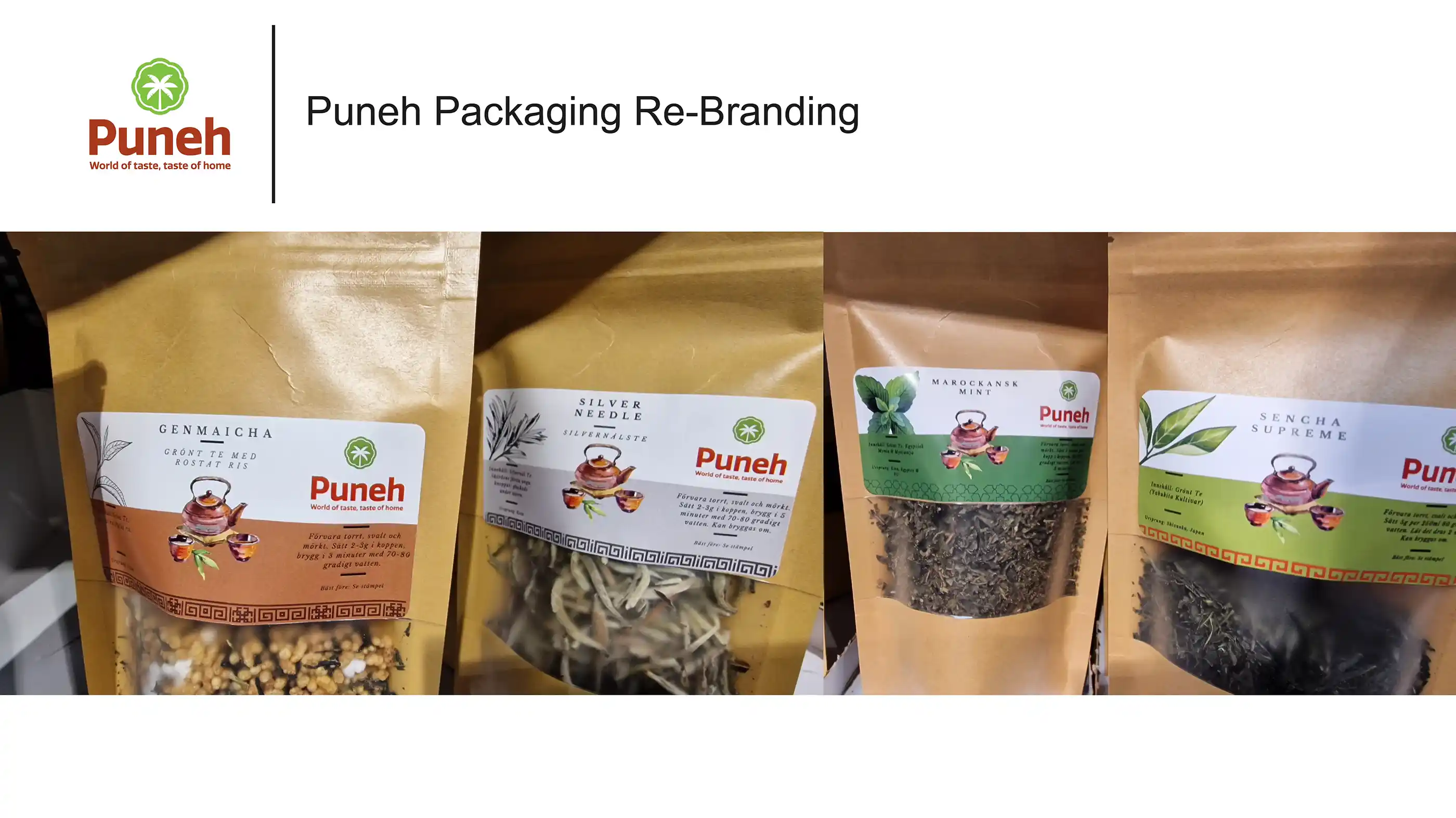
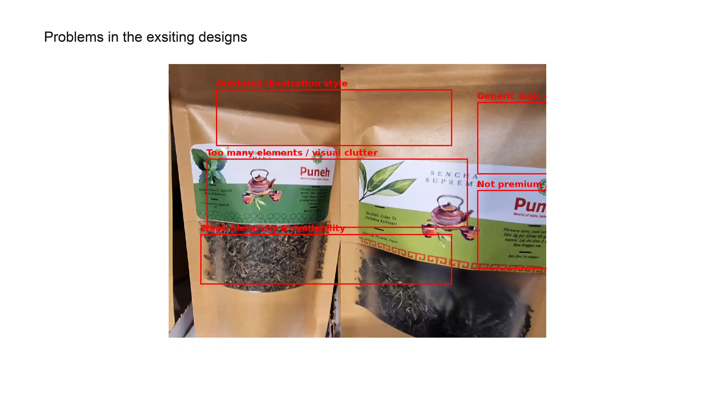
At the time of engagement, Puneh’s packaging lacked consistency and a defined system. Each product appeared visually disconnected, resulting in a fragmented brand presence. The designs felt ordinary and local, failing to convey a premium or high-end positioning.
There was limited product differentiation, weak shelf impact, and no visual storytelling to help customers quickly understand the product category. As a result, the packaging did not fully support sales or brand recognition.
The
Result
Designing a system, not just packaging
Formque Digital approached the project with a system-led strategy—building a cohesive visual language that would scale across multiple product categories.
The Visual Language
We introduced category-specific transparent windows to instantly communicate product identity:
- Chillies: A chilli-shaped window for bold recognition and visual clarity.
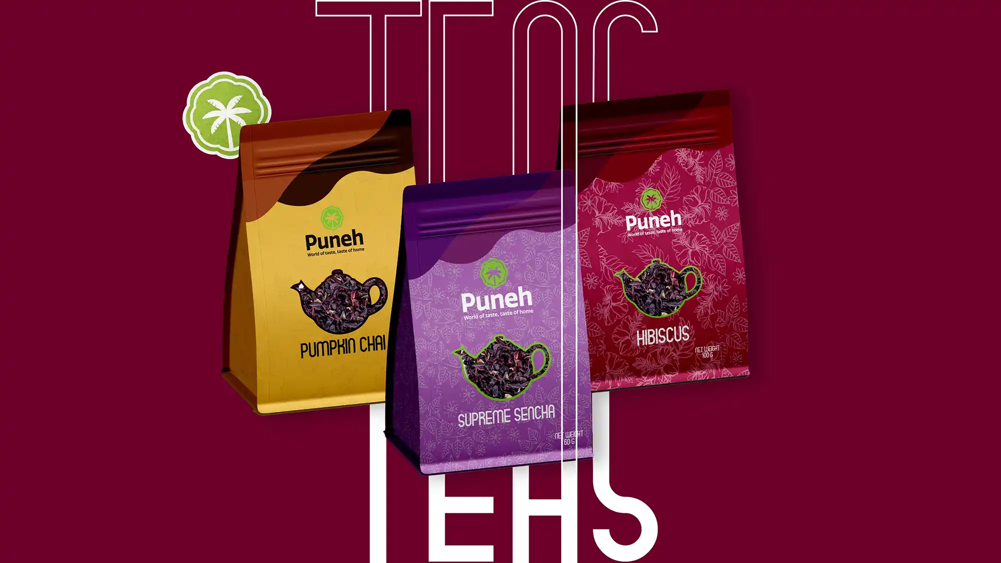
- Teas: A kettle-shaped window representing warmth, brewing, and comfort.
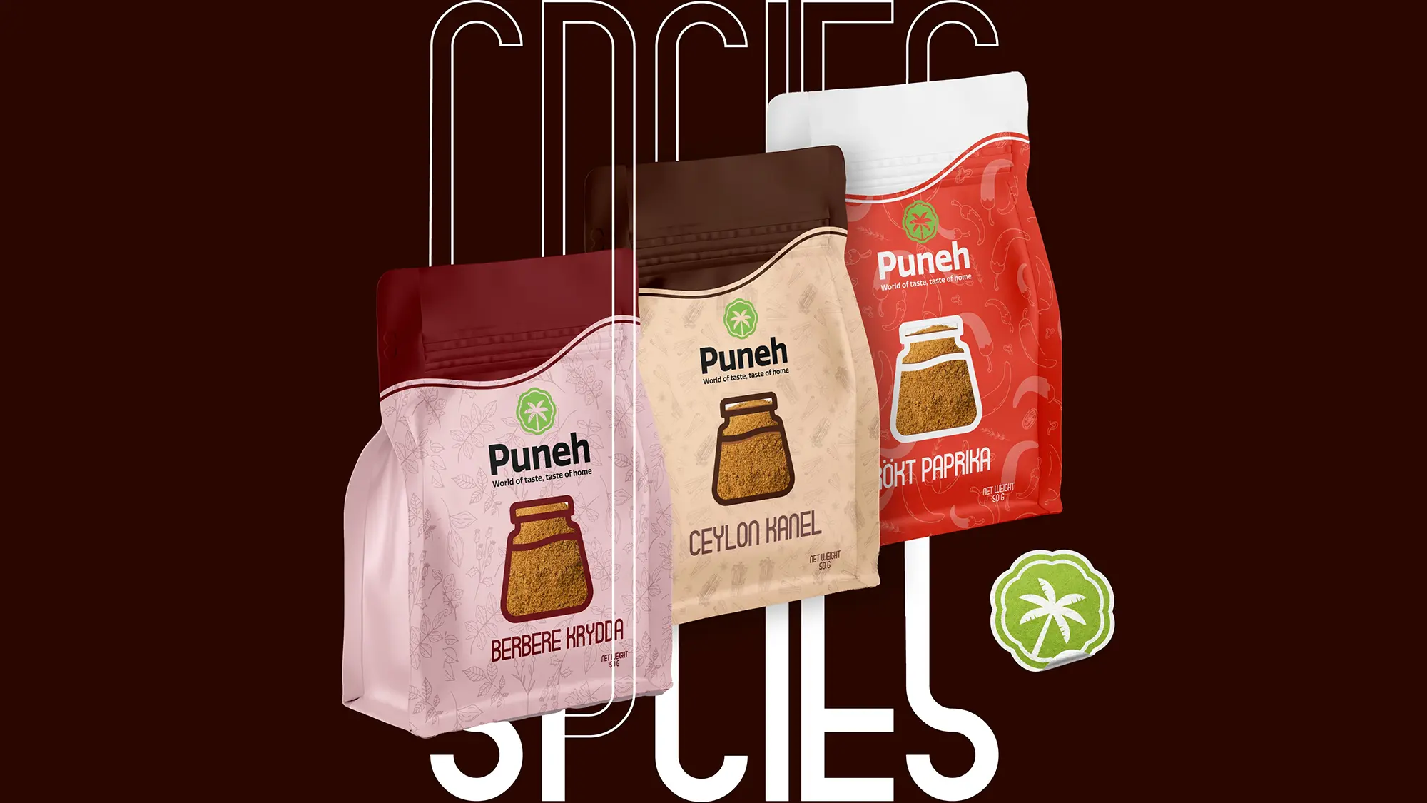
- Spices: A spice-jar window symbolizing everyday usability and authenticity.
Each category was supported with a custom-designed pattern, which became the foundation for defining color palettes, layout structure, and visual rhythm.
From ordinary to premium shelf presence
The new packaging system transformed Puneh’s brand perception. The designs created immediate shelf impact, improved clarity, and established a strong, recognizable identity. Transparent windows increased trust by allowing customers to see the product, while the structured patterns and color strategy elevated the overall aesthetic.
The packaging no longer looked generic—it positioned Puneh as a modern, export-ready brand.
Results Driven by Design
Executed between 15 February 2023 and 20 January 2024, this project formed a strong foundation for long-term growth. We worked on multiple product line inclding the teas, chillies and spices
A Scalable Brand System
By shifting the focus from isolated designs to a structured visual system, Formque Digital helped Puneh build a brand designed for growth—turning packaging into a strategic asset that supports recognition, trust, and sales.
With the refined branding and packaging system in place, Puneh achieved drastic increase in sales at an estimated
35% ↑
driven by better differentiation, premium positioning, and clearer product communication..webp)
.webp)
.webp)
.webp)
.webp)
.webp)
.webp)